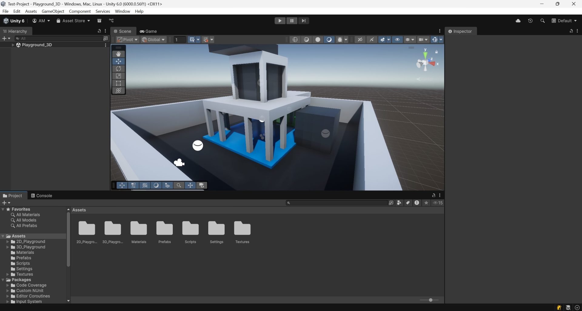
In this post we will see the most relevant UI elements and windows from the Unity Editor. How to open new windows, move them, reset the layout, etc.
0.- General Layout #
The Unity Editor uses a dockable, panel‑based UI. Common default panels are Scene, Game, Hierarchy, Inspector, Project, and Console. Layouts can be saved and restored (Window ▸ Layouts), and any window can be undocked, stacked as tabs, or split.
0.1.- Top Menu #
The global menu bar exposes all features:
- File: New/Save/Build & Run, open/close Projects, project settings access.
- Edit: Undo/Redo, Project Settings, Preferences, Play Mode options.
- Assets: Create, Reimport, Open C# Project, Labels, Import Packages.
- GameObject: Create primitives, lights, cameras, UI, 2D objects; parenting utilities.
- Component: Add built‑in components to the selected object.
- Services: Built-in menu for Unity paid serivces (Multiplayer, Chat, Content delivery, Version Control, etc.).
- Window: Open/dock windows (Package Manager, Profiler, Lighting, Services, etc.).
- Help: Manuals, release notes, Editor logs, report a bug.
- Other: You can add custom menus through scripts or packages.
0.2.- Top Toolbar #
In here you will find some shorcuts to the asset store, package manager, layouts, project searcher… But most importantly you will find the: play button (That becomes the stop button when playing), the pause button, and the next frame button.

0.3.- Workspace #
The center of your layout where windows live. Multiple Scenes and Game views can be open as tabs. Drag tabs to split horizontally/vertically, or float as separate windows.
0.4.- Bottom information box #

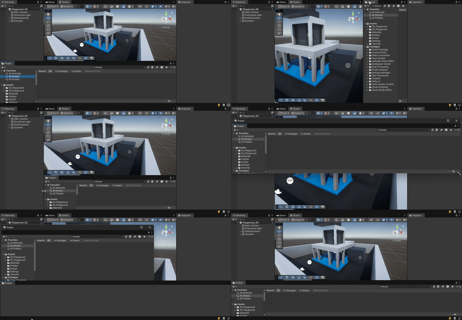
The Status Bar shows compile/build progress, import activity, domain reloads, warnings/errors count, and background tasks. Clicking messages opens details (e.g., Console). Long operations display a progress bar here.
1.- Project Window #
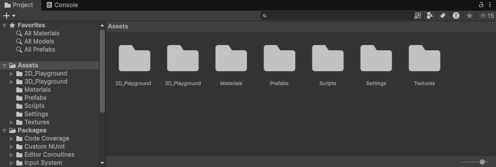
The Project window is your asset browser for everything under the Assets/ and Packages/ roots. It supports one‑column or two‑column (folder + content) views, search, labels, and custom favorites.
1.1.- Project navigator #
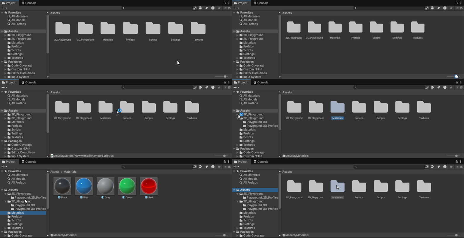
Works exactly as any regular file explorer. If you right click on any folder/file a lot of usful options will appear like the “Create” menu, or the “Show in explorer” option.
- Folders & Favorites: Pin commonly used folders. Expand/collapse with arrow keys.
- Packages: Read‑only view of assets delivered by the Package Manager.
- Drag & Drop: Into the Scene/Hierarchy to instantiate; into Inspector fields to assign. You can also drag objects from the scene hierarchy to create prefabs.
1.2.- Project window toolbar #

- Create: New folders, scripts, prefabs, materials, shaders, etc.
- Search Bar & Filter: Keyword plus type/label filters.
- View Mode: List vs. Grid; size slider for thumbnails.
- Sort: By name, type, modified time, or label.
- Options: Two‑column toggle, auto‑refresh, meta file visibility, etc.
2.- Scene Window #
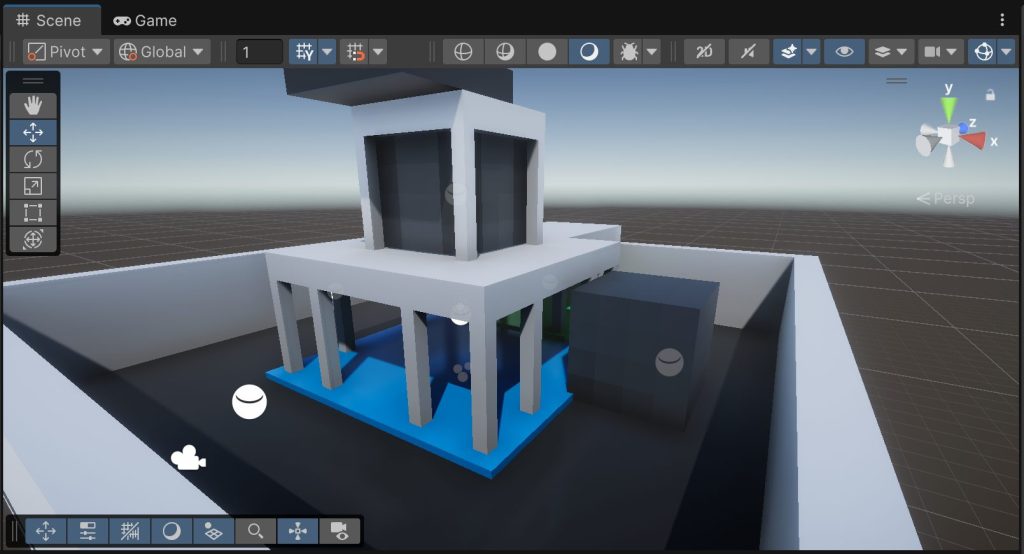
The Scene window is your authoring viewport. It hosts overlays for tools, rendering modes, and gizmos.
2.1.- Scene View #
This is the editor view where you can edit and create the scene while viewing it.
2.1.1.- Camera control #
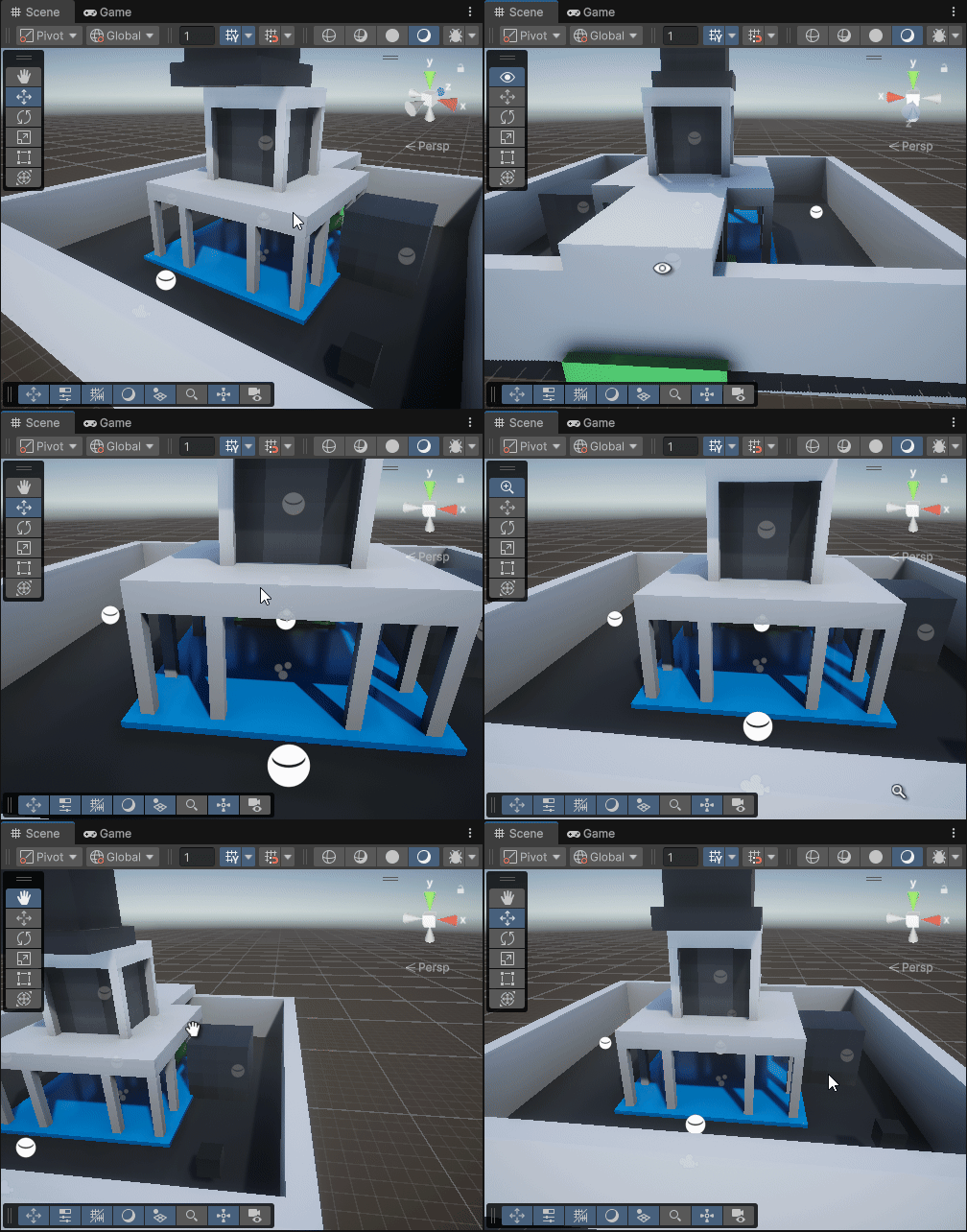
Orbit view:
- Orbit: Alt + Left‑drag (or right‑drag + hold if using first person mode).
- Pan: Middle‑drag (or Alt + Right‑drag).
- Zoom: Scroll wheel or Alt + Right‑drag.
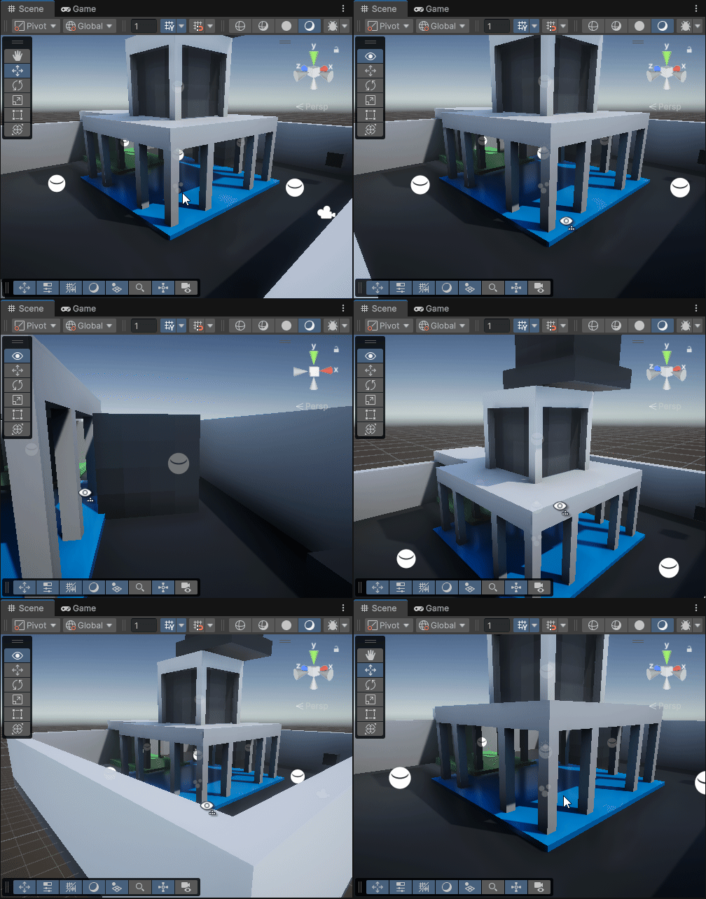
FirstPerson View:
Right‑mouse + WASD to move, Q/E down/up; Shift to speed up, Ctrl/Cmd to slow.
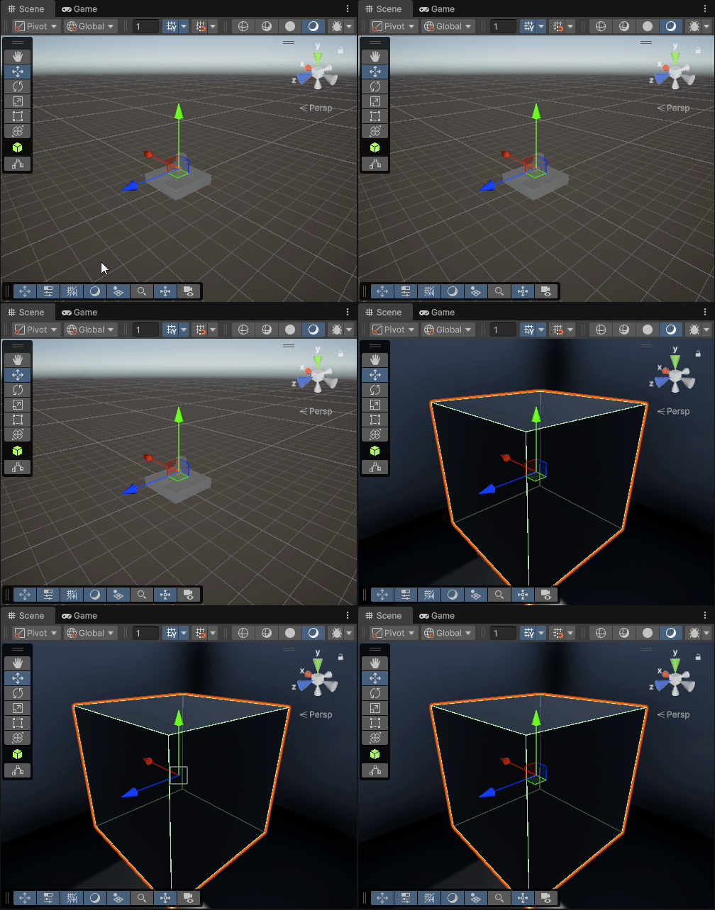
Frame selected object:
Pressing F focuses and orbits around the selection. If you loose the objects in the scene view, select one from the hierarchy and press F.
2.1.1.1.- Camera control widget #
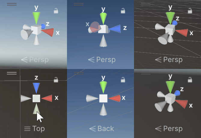
The Scene Gizmo (top‑right cube): click faces/edges to snap to views; click the cube to toggle Perspective/Orthographic. If the scene camera “breaks” you can use this to reset the view direction.
2.1.2.- GameObject selection #
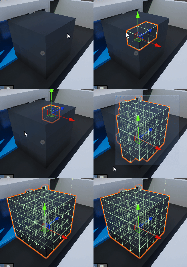
- Click in Scene or in Hierarchy. Shift adds to selection; Ctrl/Cmd toggles.
- Rect Select: Drag to marquee‑select; Shift expands, Ctrl/Cmd subtracts.
- Pickability/Visibility: Use Hierarchy eye/hand icons to hide or make unpickable in Scene (doesn’t change active state).
2.2.- Toolbar toggler widget #
Each button in here, toggles other widgets that control how you view the scene.

2.3.- Tools widget #
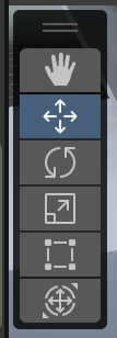
Provides transform tools: View (Q), Move (W), Rotate (E), Scale (R), Rect/2D (T), and Transform (unified). You can use this tools while pressing CTRL to make the objects movement snap.
2.3.1.- Tools settings widget #

The Pivot/Center and Global/Local toggles that change how transforms behave.
Pivot / Center (handle position & rotation/scaling pivot)
- Pivot: Places the tool handle at the object’s authored pivot. With multiple selections, the handle uses the active object’s pivot (the last selected, highlighted in the Hierarchy). Rotate/Scale act around that pivot. This is the recommended setting.
- Center: Places the handle at the geometric center of the current selection’s bounds. Rotate/Scale act around that shared center (useful to treat many objects as one group).
INFO
A model’s pivot comes from the DCC/import settings. To effectively “change” it in‑Editor, parent the object under an empty GameObject and move the parent so its origin becomes your working pivot.
Global / Local (handle orientation/axes)
- Global: Aligns the gizmo axes to world X/Y/Z. Moving along an axis ignores the object’s rotation.
- Local: Aligns the gizmo to the selected object’s own rotation (its local axes). This is the recommended setting.
INFO
With multiple objects selected, the single handle’s orientation follows the active object. Pivot/Center decides where transforms occur; Global/Local decides which axes they use.
2.3.2.- Grid & Snap widget #

- Move Snap (units), Rotate Snap (degrees), Scale Snap (increments).
- Toggle Snap while transforming: hold Ctrl (Win) / Cmd (macOS).
- Absolute Grid: Enable to snap to world grid; otherwise snapping is relative to current position.
- Increment Adjust: Change values directly in the overlay; mouse‑wheel over fields often adjusts.
2.4.- Rendering modes widget #

A drop‑down in the Scene view (often labeled Shaded) that controls how geometry is drawn.
2.4.1.- Draw modes #
- Shaded: Default lit shading.
- Wireframe / Shaded Wireframe.
- Texture/Material‑centric views: e.g., Albedo, Normal, UV overlap (availability depends on pipeline/tools).
- Pipeline Debug (URP/HDRP): Material validation, lighting, and post‑process debug views.
2.4.2.- View options #

Per‑viewport toggles that affect only the Scene view:
- 2D/3D
- Audio
- Effects: Skybox (on/off), Fog (on/off), Post‑Processing (preview effects), and other effects.
2.4.3.- Editor camera settings #
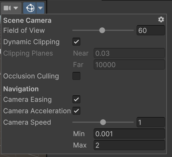
Open via the camera icon or Scene Gizmo. Controls include Field of View, Orthographic Size, Near/Far Clip, Move Speed (with acceleration)…
2.4.4.- Gizmos settings #
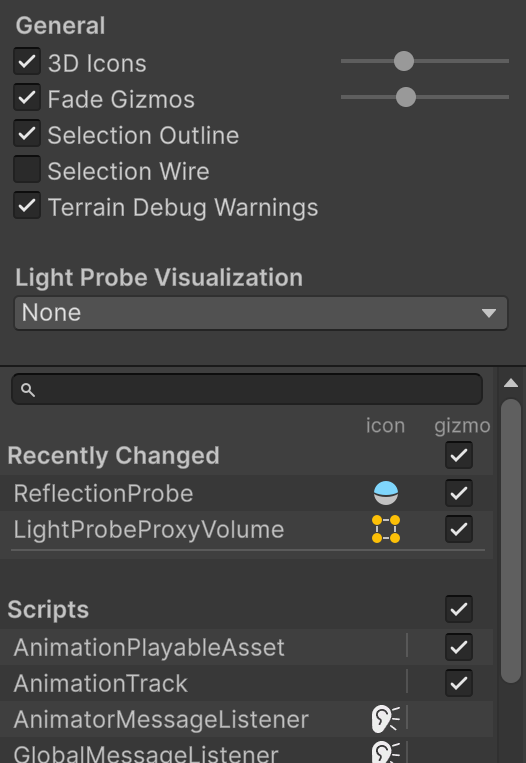
The Gizmos drop‑down lists all component gizmos and icons. You can:
- Toggle gizmos globally or per‑type.
- Adjust 3D Icons size with a slider.
- Enable gizmos in Game view for debugging.
3.- Scene Hierarchy Window #
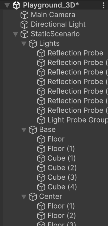
Shows all GameObjects in the active Scene(s) as a parent‑child tree. The Hierarchy defines structure, not script execution order. Parenting affects transforms, activation, physics grouping, UI draw order (under a Canvas), and some component behaviors.
- Multi‑Scene Editing: Each open Scene appears as a header; drag objects between Scenes.
- Create (
+) and Right‑Click: Add objects, empty parents, and UI. - Search: By name, type (
t:), or component. - Visibility (eye) and Pickability (hand): Scene‑view‑only; does not change
SetActive. - Reorder/Parent: Drag to change order or set a new parent; Alt while expanding collapses/expands all children.
- Context: Rename, duplicate, delete, prefab actions, set active state.
3.1.- Parenting & Transforms #
- Local vs World: A child’s
Transform.localPosition/Rotation/Scaleare relative to its parent. The parent’s transform composes with the child’s local transform to produce the child’s world transform. Resetting a child’s Transform sets it to the parent’s origin. - Pivot vs Center; Global vs Local: With multiple selections, Pivot/Center chooses the rotation/scale pivot point (object pivot or selection bounds center), while Global/Local chooses axis orientation (world axes or the active object’s local axes). Parenting changes what “local” means (it’s the parent’s frame). See §2.3.1.
- Grouping: Use an empty GameObject as a parent to move, rotate, or scale a set of children as one unit, or to create a working pivot (place the parent where you want the pivot to be).
- Preserving world pose when reparenting: Dragging in the Hierarchy recalculates local values so the object stays in place in world space. (Scripting equivalent:
transform.SetParent(newParent, true).) - Scale caveats: Non‑uniform or negative scale on parents propagates to children (
lossyScale) and can mirror meshes, invert normals, or distort physics. Prefer uniform group scale where possible.
4.- Inspector Window #
Displays and edits properties of the current selection.
4.1.- Inspecting a Game Object #
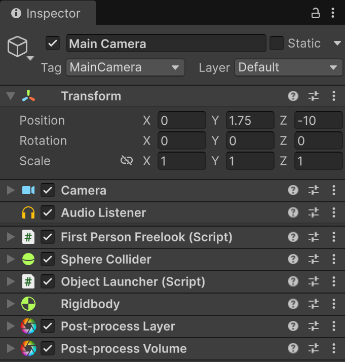
Shows the Transform at top and attached components below. Changes are applied live to the selected instance.
4.1.1.- Inspecting a Prefab #
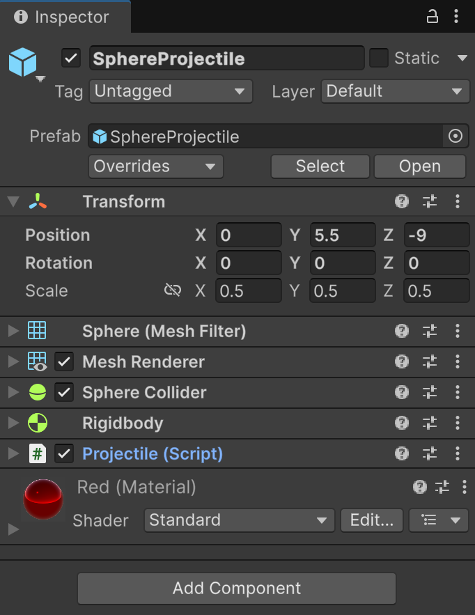
Prefab instances show an Overrides bar. Common actions:
- Open (Prefab Mode): Edit the Prefab in isolation.
- Apply / Revert: Push or discard instance changes.
- Unpack / Unpack Completely: Break the Prefab link.
- Variants: Prefabs based on other Prefabs, inheriting changes.
4.2.- Inspecting a project file #
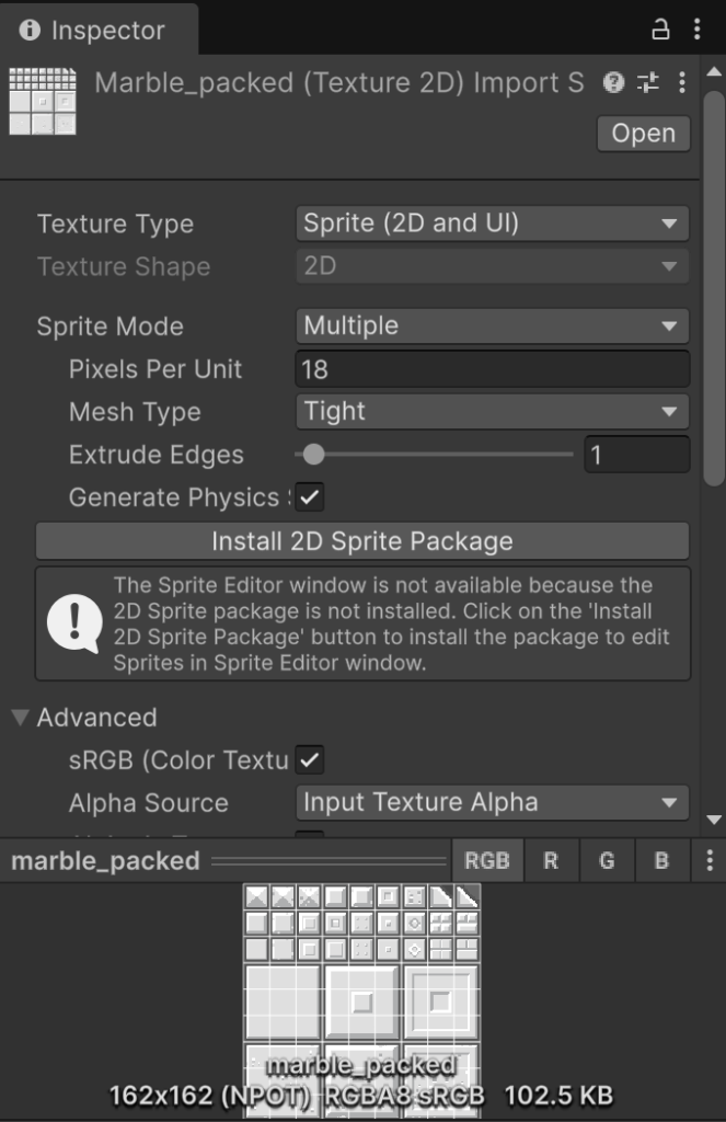
The Inspector shows import settings for assets:
- Textures: Type (Default/Sprite/Cubemap), sRGB, compression, mipmaps, platform overrides.
- Models (FBX): Scale, rig (Humanoid/Generic), animation import, materials.
- Audio: Compression format, load type, sample rate.
- Materials/Shaders: Shader selection and properties.
- Scripts: Double‑click opens in your IDE; attributes appear when used in components.
5.- Console Window #
Centralized log of Logs, Warnings, and Errors from the Editor and your game.
- Click an entry to see its stack trace; double‑click to open the source file.
- Hyperlinks in messages jump to objects/assets.
- The last message will be always previewed on the Bottom Information Box
INFO
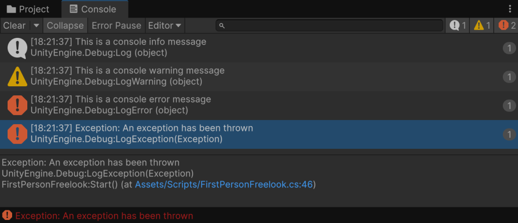
If you select any message, you will see a detailed text about it on the bottom part of the console. In there you will see from where it comes. If you double click it, Unity will open the script that sent it with the line selected.
5.1.- Console messages #
There are three types of messages:
- Information: In gray, usually display useful information and can be used to check for triggers or events in the code.
- Warning: In yellow, usually warn about possible errors. Usually they can be safely ignored once readed the message and assesed the information that it contained.
- Error: In red, they are editor or execution errors. They must always be fixed.
5.2.- Console buttons & filters #
- Clear: Empties the list.
- Collapse: Groups identical messages with a count.
- Clear on Play: Empties when entering Play Mode.
- Error Pause: Automatically pauses Play Mode on the next error.
- Search/Filters: Text search and toggles for Log/Warning/Error; package filters if available.
6.- Game Window #
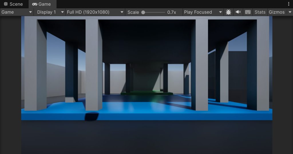
A preview of what your Player sees during Play Mode (or via dedicated camera/scene preview).
- Stats: FPS, batches, triangles, memory.
- Gizmos: Optional gizmo rendering in Game view.
- Mute Audio: Silences audio while in Play Mode.
- Safe Area (mobile): Visualize notches/insets.
6.1.- Play buttons #
Located on the top toolbar, they control Play, Pause, and Step. The Game window reflects runtime output; changes made during Play are not saved.
WARNING
Remember to only change things in the project while not playing. You can change things while playing, but most changes won’t save.
6.2.- Resolution Options #
- Aspect/Resolution: Choose presets (e.g., 16:9, 4:3) or create custom fixed resolutions.
- Scale: Zoom the Game view without changing the target resolution.
- Low Resolution Aspect Ratios / Pixel‑Perfect: Useful for retro or UI testing.
- Orientation (mobile): Switch between portrait/landscape for preview.
INFO
It’s always recommended to use 1920×1080 render resolution to see what the end user will see. If your computer struggles to render in this resolution you can always use 16:9 aspect ration, and in addition toggle the “low resolution” on to get even more performance.